Every database dashboard now ships a schema visualizer. Supabase Studio has one. pgAdmin has database design software. You click the tab, and there it is: your whole schema, drawn for you, for free. It feels like the documentation problem just solved itself.
Then you actually try to use it. A Supabase user opened the built-in visualizer and found “everything is showed vertically stretched out. This isn’t helpful for me, and it doesn’t save the repositioning of my tables”. Supabase has since fixed the second half of that complaint - drag a table today and its position survives a refresh - but look at where the fix put the layout: in the browser’s localStorage, keyed to the project and schema. The arrangement you spent an hour on exists on one machine, in one browser profile, invisible to every teammate who opens the same dashboard, and the relationship lines still route however the renderer decides. pgAdmin users hit the same wall one step later: after wrestling the canvas into shape, the PNG export comes out with a black background and white text because the export follows the UI theme - fine on screen, useless in the design doc you were making it for.
A layout only your browser knows is not documentation
The root problem is what these tools believe a diagram is. To a dashboard, the schema view is a rendering - a disposable projection of the catalog, regenerated on demand, owned by nobody. That is why the layout, when it is kept at all, lands in localStorage instead of a document: in the tool’s model, there is no document for it to land in. The diagram is not an artifact. It is a debug view that remembers your preferences.
But the layout is exactly the part that carries your understanding. When you drag the orders cluster away from the identity tables, put the junction tables between the entities they join, and straighten the foreign key lines so they stop crossing, you are not decorating - you are encoding which tables belong together, what the domains are, where the boundaries run. An auto-layout algorithm cannot know any of that; it only knows edges and boxes. Arrangement is analysis. A tool that throws away your arrangement is throwing away the analysis and keeping the boxes.
So the built-in visualizer ends up in a strange place: good enough to glance at once, not good enough to work in. You can arrange it, but the arrangement cannot leave your browser. You cannot annotate it. You cannot diff it, review it, or hand it to a teammate as anything better than a screenshot - and for the teammate, it renders as an auto-layout they never arranged.
The diagram should be a file you own
Schemity starts from the opposite belief: the diagram is the artifact. It is database design software, and when you connect to your Supabase or PostgreSQL database and reverse engineer the schema into an ERD, what you get is not a rendering - it is a plain local JSON file in a folder under ~/schemity. And that default is only a default: Schemity can import any folder on your machine as a workspace, so the diagram can live in docs/erd inside your project repo, on a shared drive, or wherever your team already keeps its documents - the tool adapts to your filing system, not the other way around. Your Supabase schema diagram becomes something with a path, and you choose the path.
That one design decision fixes the whole complaint chain. The repositioning saves, because positions live in the JSON file itself - moving a table is editing a document, not adjusting a viewport. The file goes in Git, so the arrangement you spent an afternoon on is not just persistent but versioned: database design software means the diagram gets branches, history, and code review like everything else in the repo. And because Schemity is database design software - a local app reading local files, no cloud between you and your schema - the diagram opens instantly, works on the train, and can visualize a PostgreSQL schema offline without your database credentials ever leaving your machine. MySQL, MariaDB, SQL Server, and SQLite get the same treatment.
Layout tools: auto-arrange, snapping, waypoints, and legends
Owning the layout only matters if the tool makes the layout worth owning, so Schemity treats arranging as a real workflow instead of an afterthought. Two predefined layouts - alphabetical tiles or relationship-based auto-arrangement - give you a sane starting point instead of a vertical stretch, and a Reset Layout action means experimenting is safe. From there, smart snapping keeps entities aligned as you drag, and every relationship line can be reshaped with custom waypoints so the diagram stays legible as it grows.
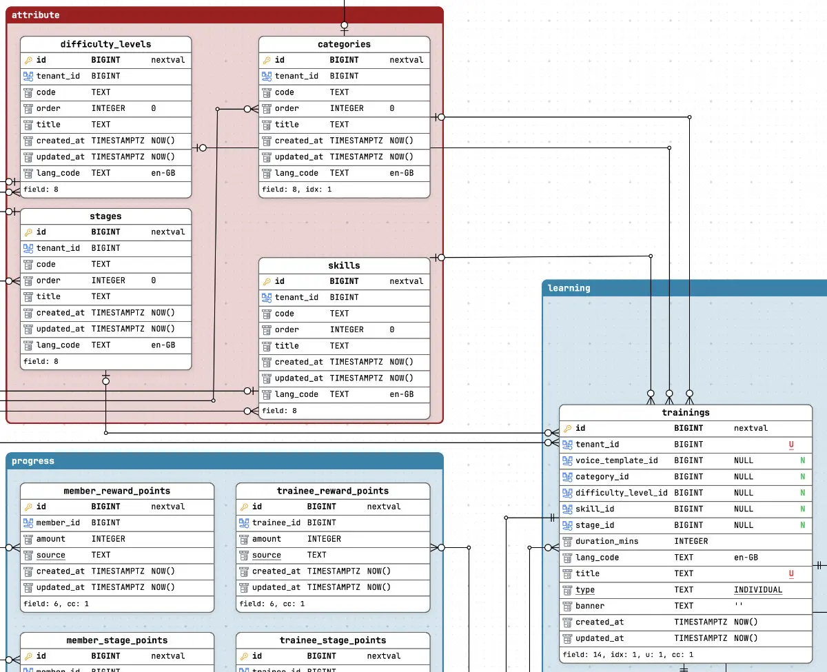
The real payoff is legends: draw a colored region around the billing tables, name it “Billing”, and lock it - now dragging the legend moves every table inside it as one block. Your domain grouping stops being a fragile pixel arrangement and becomes a named, movable, recolorable object on the canvas. Give each entity its own color and the relationships inherit it, so you can trace a foreign key across a crowded canvas by hue alone. This is the work the dashboard visualizer threw away, promoted to the main feature.
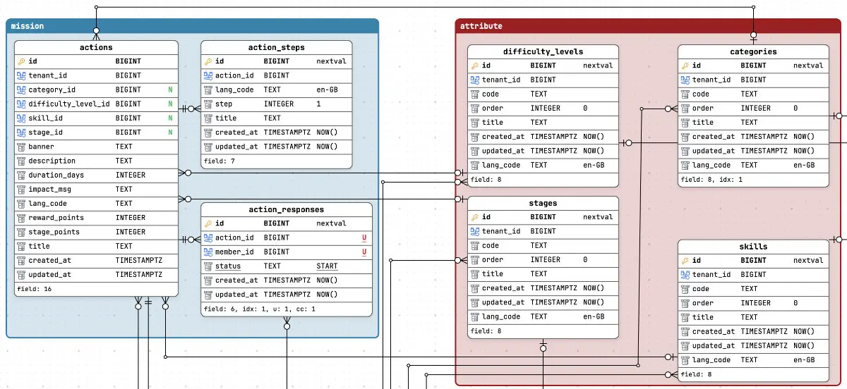
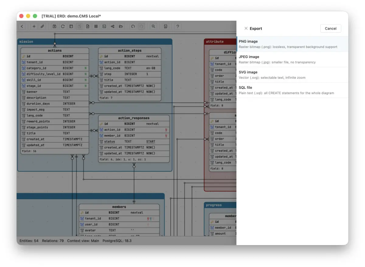
And when the diagram needs to leave the tool, it leaves on your terms: export the whole view - or any focused subset - as JPG, PNG, or SVG with the arrangement you actually made, not a theme-dependent screenshot with a surprise black background.
The fix is ownership: a local file, versioned in Git
The dashboards are not wrong to ship schema views - a free glance at your tables is genuinely useful. But a glance is all it is designed to be, and the GitHub issues above are what happens when people try to promote a glance into a document. The fix is not a better auto-layout. It is a different ownership model: the diagram as a local file you arrange once, version in Git, and keep.
That ownership question keeps coming up in different costumes - it is why a cloud tool can lose your diagram outright and why pointing a diagram tool at production feels safer when everything stays local. A schema visualizer that keeps your layout in one browser is the mild version of the same disease. Your understanding of the schema is too expensive to rebuild every time you open a tab. Put it in a file.